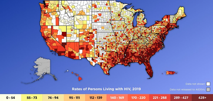
Ever wonder how many people are living with HIV in your county? Or whether the HIV-positive folks in your state are getting connected to care and maintaining an undetectable viral load? Such information—and much, much more—is easy to find on AIDSVu’s interactitve maps of the United States. Seriously: all you have to do is click on your region or type in your county or state and the information pops up.
Even better, AIDSVu recently updated its maps and related graphics to include data from 2019, the latest year available (and the last year before the COVID-19 pandemic upended HIV services and data collection). AIDSVu also increased the number of cities on the map that include nuanced HIV data available for each ZIP code in that city. Atlanta, Dallas, Nashville, New York City, Los Angeles and 10 other cities were included in AIDSVu’s latest upgrade, bringing the total to 50 cities. The new version also added data for Orange County, California, part of the Los Angeles metropolitan area.
The ZIP code maps also include information on the HIV care continuum: new diagnoses, late diagnoses, linkage to care, receipt of care and viral suppression.
A late #HIV diagnosis is when an individual is diagnosed with AIDS within 3 months of an initial HIV diagnosis. Between 2018 and 2019, over half of US states saw a decrease in late diagnoses. Learn more about the #HIVcarecontinuum today: https://t.co/ukZrkmKQDP pic.twitter.com/TvL4aJTkf6
— AIDSVu (@AIDSVu) December 16, 2021
Of course, AIDSVu maps illustrate more basic information too, such as HIV rates and prevalence—in other words, the number of people living with HIV and how that number compares with the overall population. For example, if you click on Bucks County, Pennsylvania, and then toggle through the datasets available, you will discover that 24 people were diagnosed with HIV in the county in 2019 and that a total of 959 people were living with HIV in the county that year; the HIV prevalence was stated as, “In 2019, 177 of every 100,000 people were living with HIV.”
In addition, you can filter the HIV data into categories of age (for example, how many people with HIV are ages 13 to 24 or 35 to 44), sex (male or female), race (Black, Hispanic, white) and transmission (male-to-male sexual contact, injection drug use and other routes).
Data for pre-exposure prophylaxis (PrEP, to prevent HIV) is also included. Revisiting Bucks County, you find that at least 425 people in the county were on PrEP in 2019, translating to 79 out of every 100,000 people. AIDSVu also compares the number of PrEP users with the number of new diagnoses. For Bucks County, it states: “In 2019, for every one person newly diagnosed with HIV, there were 10.9 persons using PrEP.”
What’s more, the map allows you to compare the HIV data with a number of social determinants of health—for example, the percentage of people who have a high school education or live in poverty or are unemployed. You can also look at the area’s rates of sexually transmitted infections (chlamydia, gonorrhea and syphilis) and learn about HIV-related policies in effect in that area (Medicaid expansion, HIV criminalization and HIV prosecution laws).
AIDSVu’s updated data and maps provide a picture of the #HIV epidemic across the U.S. and allow you to compare other key indicators and social determinants of health maps. Check out the maps today: https://t.co/ukZrkmKQDP pic.twitter.com/q6MkEXdAfb
— AIDSVu (@AIDSVu) December 17, 2021
If all this powerful information seems overwhelming or confusing, don’t worry. The AIDSVu map includes a tutorial. And it allows you to download and share the maps and data.
“Every year when we update our state- and county-level maps we gain a greater understanding of the HIV epidemic in the United States,” said Patrick Sullivan, DVM, PhD, professor of epidemiology at Emory University’s Rollins School of Public Health and principal scientist for AIDSVu, in a press release about the updated maps. (AIDsVu is presented by Rollins School of Public Health in partnership with Gilead Sciences and the Center for AIDS Research at Emory University.)
“Visualizing these data,” Sullivan continued, “helps draw attention to underserved communities and geographic regions and helps policymakers and public health officials to make informed decisions about resource allocation. This is especially important now, as the COVID-19 pandemic continues to impact other infectious diseases such as HIV and hepatitis C.”
AIDSVu has released interactive maps and data visualizing the HIV epidemic at the state and county level for 2019, further illustrating how the HIV epidemic impacts cities and neighborhoods at a fine geographic level. Learn more: https://t.co/EYbU7oCVbD pic.twitter.com/d3uFBvushT
— AIDSVu (@AIDSVu) December 16, 2021
Visit AIDSVu.org for sharable infographics based on the latest HIV data as well as interviews with HIV leaders. For a collection of related articles in POZ, click #AIDSVu.


Comments
Comments